Tan. Gray. Beige. They’re great colors, and we’ve all used them. Our last home was gray at every turn, and I loved it. But it’s time to step out from among the known and try something different. I’ve got a few neutral alternatives you may be scared to try; resist the urge to slam your laptop closed...a whole new world awaits!
Blue
I once heard a designer say, “Think of the color blue like jeans.” So true. Jeans go with everything, right? They can be dressed up or dressed down. Here are a few blues to try and, ultimately, love.
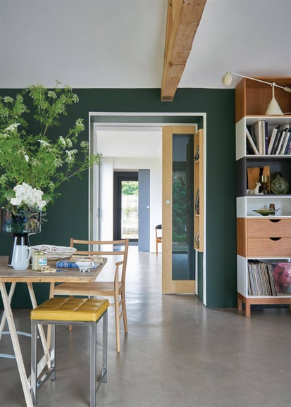
I’ve seen this color used a handful of times in the design world, and I am swooning. I especially love the idea of pairing it with a pristine, white kitchen. Carefully consider the room you choose. As you can see below, the color looks darker with less light. It's a great bold color that still acts as a somewhat neutral.

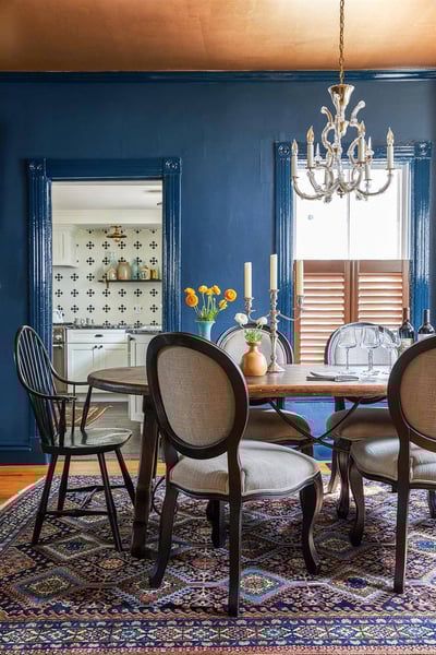

Hague Blue by Farrow & Ball
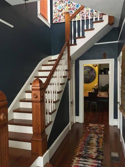
Anchors Aweigh by Sherwin Williams
Used in one of my favorite nurseries (this nursery was actually my #1 nursery inspo pic), it gives the space a fun punch of color, while still remaining calm and "neutral" enough to allow you to play with other elements in the room.

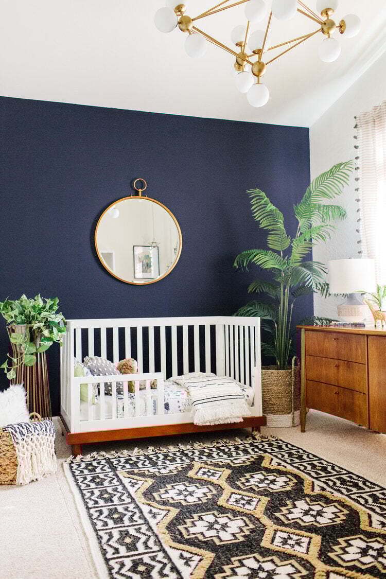
design by Alexandra at Ave Styles
Green
Farrow & Ball does it again. Though this green is a playful pop of color, it looks clean and finished, which is a perfect neutral alternative. And, bonus, it goes great with the natural wood elements in this room.
Studio Green by Farrow & Ball
Yes, I love the Green Bay Packers, but this is a different Green Bay we’re talking about. All white kitchens really are gorgeous, but look at this beautiful green on the island! It’s just enough to not be overbearing, but to liberate the risk-taker inside you (you know it’s there!).

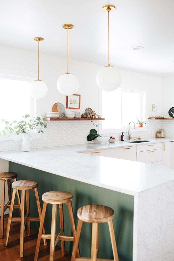
Green Bay by Benjamin Moore
Black/Deep Gray
I know this one really might make some of your jaws drop. It’s such a dark color, yet when done right it really makes a statement. PLUS, you can still add a variety of colors you’ve been wanting to try with your pillows, hand towels, art, etc.
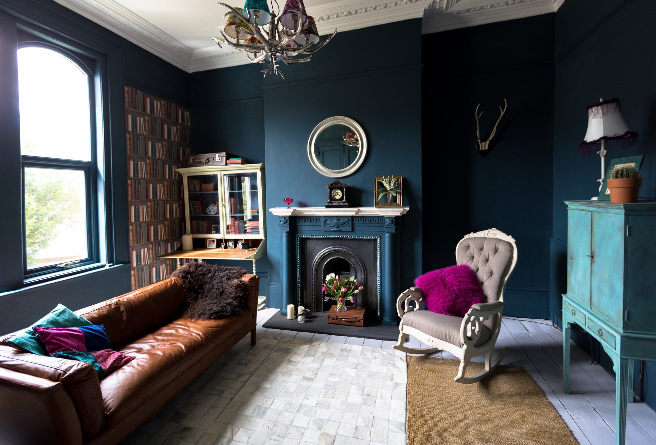
Heather, an interiors blogger from the UK, wrote a post about this color that I absolutely love. She talks about the doubt and hesitation that comes with painting a wall black, but revels in the victory of how totally amazing it looks afterward. The new color completely changed the feel of the room and according to her it even made the space feel larger. I’ll take that as a win.
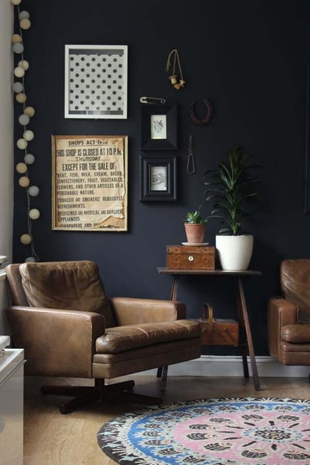
La Plancha Premium by Valspar
This gray is a little less bold but still makes a beautiful, deep base for art, rugs and other accessories. I've seen this used in bathrooms, on fireplaces, and I am telling you, I'll definitely be including this in my next remodel. I wonder if I can get the husband on board?
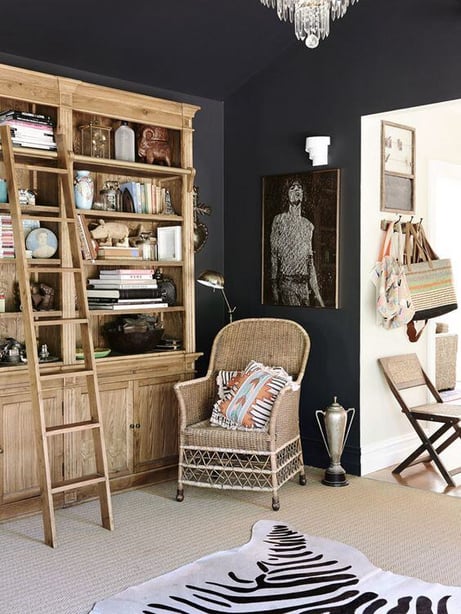
Domino by Dulux
from thedesignfiles.net
Colors are so important for your home, they affect your mood and can completely transform a space. Hope you're feeling a little inspired to experiment with some bold colored paints in your home!
By: Linden Design Co.
for Brennan Enterprises
Topics: